


Halo Master Chief Collection
Main Menu Redesign
Pre-Production - Menu Flow Chart
This project is a UI redesign of the Halo master chief collection
main menu. In my redesign I am only using 3 of the halo games in
the collection as doing anymore would be unnecessary.
The video shows the current progress of the menu. I have been
using Unreal Engine 5 for this project to further improve my skills
with Unreal Motion Graphics and advanced user interface
materials.
As this is a work in progress, this page is essentially
a development/design blog with regular updates.
The video is subject to change whenever a large update is pushed.
My goal with this project was to show my own take on an existing UI menu design using
Unreal Engine 5 to create it. Main menus are the first interaction with a game that a player
has so the design of them is essential for a good first impression
This project will help to show my process of iterative design to achieve a final and
polished design.
Solo Project
Created In Unreal Engine 5
Work In Progress
User Interface UMG
Redesign
UI/UX

The flow chart for the main menu's navigation was the first task I completed during the initial pre-production phase of this projects development. It lays out how the user can navigate the menu to achieve their desired goal. I designed it to be as simplistic as possible whilst having all the necessary functions that are required from a menu system.
Starting off with a 2D layout like this is an important part of my design process as it allows me to refer back to it when creating it in the game engine. Having a 2D flowchart also allows me to quickly iterate on it and prototype alternative ideas without touching Unreal Engine, as making significant changes to the flow of a menu inside UE5 can be time consuming.
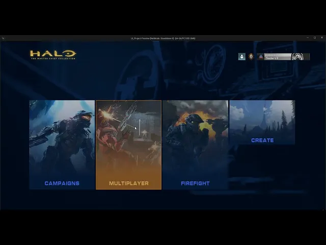
This video shows my first version of the new menu. I attempted a simplistic design with a blended video user interface material that changes based on the game your mouse is hovering over, as seen in the video.
After reflecting on the design. I really liked how the blended videos looked for each game, however the menu overall felt empty and lacked that classic halo feel.
I plan to iterate on this design with the intention of using up the screen space more whilst keeping the elements that I liked from this design and incorporating them into my next iteration. I also feel as though the menu could use more colour and contrast, especially blue to really give it that halo feel.
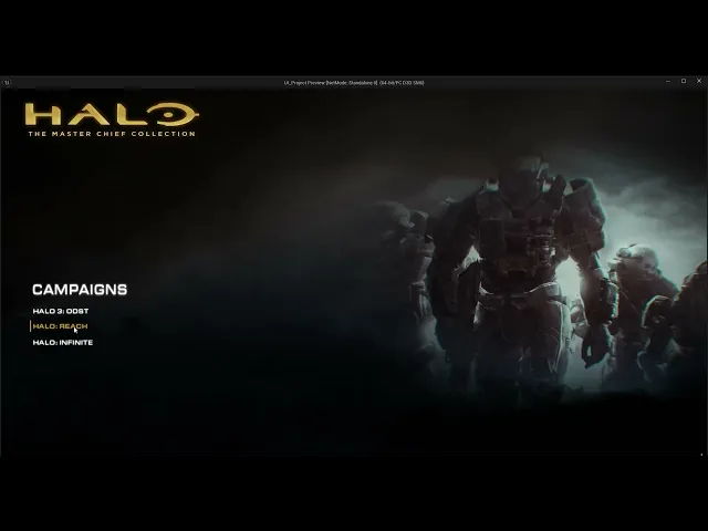
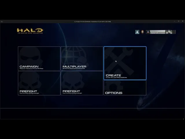
This video shows my first iteration of the menu I created inside Unreal Engine 5. It still has placeholder and prototype elements to it as it may not be my final iteration, so having fully polished art for the menu could be an inefficient choice as it could be changed at any moment. This is the main reason I use simple placeholder art when prototyping and interating.
This version includes the classic halo title screen which I remade. I also added a smooth transition to the main menu with a fading effect.
The menu itself I designed to be much more blocky to fill the empty space. I believe this resulted in a nice and readable menu that holds its simplicity with a more aesthetically pleasing look to it. I also kept the changing videos from version 1. My next version will be focused on continuing this design with more polish and features.
These 2 images show my latest iterations of the menu design. Following my last version, I realised how sloppy the new artwork I made for the menu buttons actually looked, especially inside Unreal Engine. I decided to use thinner outlines, solid white icons/text and a basic black background with the opacity dropped. This gives the buttons a modern feel whilst remaining true to the sci-fi Halo theme. I am undecided on which of the two versions I should further development on in my final iteration, so I will be asking for feedback from friends and other designers to gain some insight.
In the latest update, I have been working on some better looking buttons for the menu. I believe this design stands out more, however after reflecting on it, I think it stands out to much. The glow should be more subtle and thinner to give it a modern and slick design feel.
More Updates to come soon - Last updated 21/02/2026
Version 1
Iteration 1
Iteration 2
Iteration 3&4
Halo Master Chief Collection
Main Menu Redesign
Pre-Production - Menu Flow Chart
This project is a UI redesign of the Halo master chief collection
main menu. In my redesign I am only using 3 of the halo games in
the collection as doing anymore would be unnecessary.
The video shows the current progress of the menu. I have been
using Unreal Engine 5 for this project to further improve my skills
with Unreal Motion Graphics and advanced user interface
materials.
As this is a work in progress, this page is essentially
a development/design blog with regular updates.
The video is subject to change whenever a large update is pushed.
My goal with this project was to show my own take on an existing UI menu design using
Unreal Engine 5 to create it. Main menus are the first interaction with a game that a player
has so the design of them is essential for a good first impression
This project will help to show my process of iterative design to achieve a final and
polished design.
Solo Project
Created In Unreal Engine 5
Work In Progress
User Interface UMG
Redesign
UI/UX
The flow chart for the main menu's navigation was the first task I completed during the initial pre-production phase of this projects development. It lays out how the user can navigate the menu to achieve their desired goal. I designed it to be as simplistic as possible whilst having all the necessary functions that are required from a menu system.
Starting off with a 2D layout like this is an important part of my design process as it allows me to refer back to it when creating it in the game engine. Having a 2D flowchart also allows me to quickly iterate on it and prototype alternative ideas without touching Unreal Engine, as making significant changes to the flow of a menu inside UE5 can be time consuming.
This video shows my first version of the new menu. I attempted a simplistic design with a blended video user interface material that changes based on the game your mouse is hovering over, as seen in the video.
After reflecting on the design. I really liked how the blended videos looked for each game, however the menu overall felt empty and lacked that classic halo feel.
I plan to iterate on this design with the intention of using up the screen space more whilst keeping the elements that I liked from this design and incorporating them into my next iteration. I also feel as though the menu could use more colour and contrast, especially blue to really give it that halo feel.
This video shows my first iteration of the menu I created inside Unreal Engine 5. It still has placeholder and prototype elements to it as it may not be my final iteration, so having fully polished art for the menu could be an inefficient choice as it could be changed at any moment. This is the main reason I use simple placeholder art when prototyping and interating.
This version includes the classic halo title screen which I remade. I also added a smooth transition to the main menu with a fading effect.
The menu itself I designed to be much more blocky to fill the empty space. I believe this resulted in a nice and readable menu that holds its simplicity with a more aesthetically pleasing look to it. I also kept the changing videos from version 1. My next version will be focused on continuing this design with more polish and features.
These 2 images show my latest iterations of the menu design. Following my last version, I realised how sloppy the new artwork I made for the menu buttons actually looked, especially inside Unreal Engine. I decided to use thinner outlines, solid white icons/text and a basic black background with the opacity dropped. This gives the buttons a modern feel whilst remaining true to the sci-fi Halo theme. I am undecided on which of the two versions I should further development on in my final iteration, so I will be asking for feedback from friends and other designers to gain some insight.
In the latest update, I have been working on some better looking buttons for the menu. I believe this design stands out more, however after reflecting on it, I think it stands out to much. The glow should be more subtle and thinner to give it a modern and slick design feel.
More Updates to come soon - Last updated 21/02/2026
Version 1
Iteration 1
Iteration 2
Iteration 3&4